Archive for the Dinnerware Category
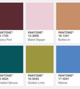
The Colors You’re Going to See the Next Six Months.
Every season the team at the Pantone Color Institute evaluates the colors shown by fashion designers in their collections at New York Fashion Week.
From here, we get the PANTONE Fashion Color Report. These are the colors that are influencing designers, inspiring retail, and informing artists.
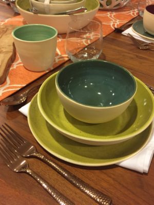
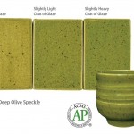
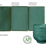
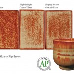
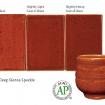
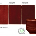
In this year’s 2017 Fall and Winter Color Report, there’s a lot of colors I’m very fond of. I’ve been using a lot of these colors in the Mid Century dinnerware set. My versions would be Deep Olive Speckle, Deep Sienna Speckle and Fire Brick paired with the Tourmaline. You can see these on the Bungalow Potter Glazes page.
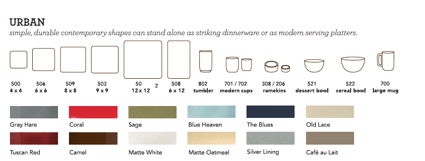
Grenadine also shows up in my Urban line. I haven’t officially launched the Urban line, but it’s essentially exactly what it sounds like–smooth, sleek, sexy, chic plates and pieces that make you want to throw out your Ikea dishes. What I love about this line is that its not pretending to be anything other than it is. Simple, chic, and understated with colors that connect. To check out the dinnerware catalog, click here for the Bungalow Potter Dinner Ware Catalog. You can even take a mini peek at the Urban line in this mini graphic. It’s pretty straightforward.
Autumn Maple has to be my favorite color in this year’s trendcast. It’s essentially Bungalow Potter orange, and let’s face it, orange IS my favorite color.
Overall, these trend colors are pretty classic, and include colors that I’ve been offering glaze recipes for since 2013.
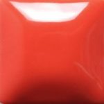
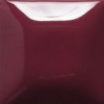
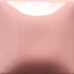
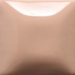
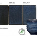
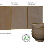
Here’s a look at some of the reduction glazes and the solid glazes from this palette. Not all of them are exact, but man, they’re almost on the dot.
Bungalow Potter Bungaloware™ Glazes
Bungalow Potter SOLID Glazes


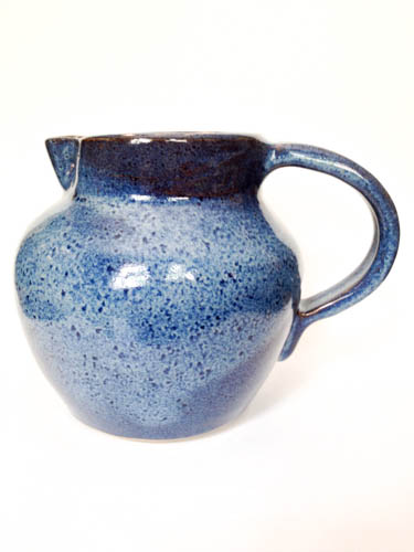 Roly Poly Stoneware Pitcher
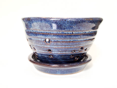 Summer Berry Bowl
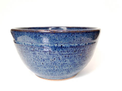 Hall + Oats N’ Honey
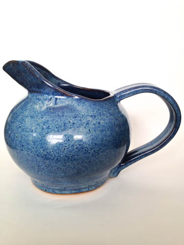 the Eleanor™ Pitcher
 the Percy Mug
